Welcome to Week Eight of the Fall 2024 One Room Challenge – the FINAL REVEAL of eight weeks of blood, sweat, and tears!! Well, maybe not that dramatic, but I do equate participating in a One Room Challenge to giving birth – when you’re in it you’re working hard, it feels like it’s taking forever, and it can be painful. But then at the end, you have this incredible creation you’re staring at with love, and you forget all about the pain and hard work. Next thing you know, you’ve signed up for another One Room Challenge, and can’t wait to bring another space to life!!
In case you’re new here, I’m an interior designer based in Great Falls, Virginia, and since 2022, while concurrently transforming my clients’ homes, I’ve also been transforming one room at a time in my own home, and documenting the process on my blog and social media for the One Room Challenge. The ORC is a bi-annual event, where every spring and fall, designers, home bloggers and DIY’ers make over a room in 8 weeks. It’s not a competition, as there is no winner, but it is a super-fun, supportive online challenge that really works to inspire a person to get a space completed in a short amount of time! And for those who just want to follow along, it’s also super fun and informative to keep up with the weekly progress, and see all of the “Reveals” on Week Eight!! I highly recommend you check out all of the other participants here.
For this One Room Challenge, I’m transforming our previously bland and uninspiring Primary Bedroom and Sitting Room into a “Romantic Retreat”, full of colors, textures, patterns, and lots of good vibes! If you want to catch up on all the previous weeks, here they are:
And now, here we are in Week Eight, and the Romantic Retreat is COMPLETE!! I can’t wait to show you allllllll the details!
Romantic Retreat Before
But wait, in order to truly appreciate the full reveal of the Romantic Retreat, I have to share where we started eight weeks ago:
Our Primary Bedroom BEFORE – Summer 2022 – the view from the hallway looking into the bedroom. The house had been staged to sell, and although the all-neutral color palette may appeal to some, it definitely was NOT my style. Besides adding color and pattern, I also knew I wanted this space to look and feel luxurious and inspiring – the prefect sanctuary to start and end each day. I’ve always wanted a wall mural in my bedroom, and also planned to ditch the plastic horizontal blinds, replace the ceiling fan, and update the fireplace by closing up the built-in tv cabinet, and designing a new mantel, surround and hearth
The Primary Bedroom BEFORE – looking from the windows towards the hallway and the sitting room. My husband doesn’t have a lot of opinions about what changes need to be made, but he had a strong distaste for the decorative columns flanking the entry into the sitting room – so those were added to the list of things to get rid of.
The Sitting Room BEFORE – looking from the Primary Bedroom towards the Primary Bathroom. This space is awkward, but I knew I would be able to fit our huge vintage armoire on the wall where the sofa was. I also wanted seating, and I needed to find a space for a coffee station, replace the “Swiss cheese” ceiling lights with a pretty light fixture, and again, ditch the horizontal blinds on the French doors leading to the balcony, and the window.
The Romantic Retreat AFTER
All AFTER photos were taken by Mary Pat Collins – the sweetest and hardest working photographer in the DC area! She captured this project so well, and is the absolute best to work with!
A boring, beige bedroom transformed into a Romantic Retreat!! With walls drenched in shades of mauve to match the bed, new bedding, pretty art, stylish and highly functional furniture, modern lighting, luxurious curtains and sheers, and a redesigned fireplace, this room has turned out even more beautifully than I expected!
The Romantic Retreat AFTER looking toward the hallway and sitting room. No more useless decorative columns, and the perfect placement of the wall mural where it can be seen in the bedroom, and helps to tie everything together.
The Sitting Room AFTER with the glorious Paradise Wall Mural, a stunning new chandelier, my beloved vintage armoire, a cozy new swivel chair and secondhand MCM side table holding the heirloom art nouveau lamp, new custom window shades, and last but definitely not least, our fabulous new bespoke coffee station!
Romantic Retreat Details and More Photos
Whether in my client projects, or when redesigning a space in my own home, I tend to pay a lot of attention to the details. I really do believe that the details in design matter a lot, and they can help create a room that is greater than the sum of its parts. My design process typically starts with one inspirational image or element from which all of the other details are pulled. Sometimes it’s a piece of unique art a client owns that is our jumping-off point. It could be a piece of furniture which is a family heirloom that’s the inspiration for the space, or a particular color the client loves. Whatever the item, it’s typically something that gives a feeling to the client that embodies how they want to feel in their new space. In this Romantic Retreat project, I knew from the start I wanted to incorporate a wall mural, and when I found this one from Anthropologie, I fell hard! It was like I could immediately imagine it inspiring color choices, patterns, textiles, and romance! Once I had chosen the mural, it was so easy for all of the other details to fall into place.
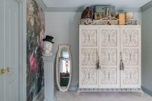
As soon as I received the mural, I opened it up to help me choose the paint colors for all the walls. For the sitting room, I really wanted to play off of all the gorgeous green tones in the mural, so I chose Sherwin Williams Sea Salt for the walls, and Sherwin Williams Silvermist for all the trim. The column holding the bust was an old CD storage tower I had, but it’s hand-carved with pretty details, so I painted it to match the trim and gave it a new purpose. I found the plaster bust at a flea market years ago, and named her “Dame Thérèse-Lucy de Dillon” after one of Marie Antoinette’s ladies in waiting. I recently purchased the embellished top hat at the Luckett’s Fall Vintage Market. I had no idea what I was going to do with it, but I’ve always wanted a vintage top hat, and loved the velvet ribbon and vintage millinery flowers that had been added to it. When I got home and saw Dame Thérèse-Lucy staring at it, I decided it was the perfect accessory to give her just the right amount of sass and whimsy! Both the armoire and the mirror are vintage, and traveled across the world with us from South Africa. The armoire is a hand-made piece, and I’m not sure what color it was originally. when I bought it from a vintage dealer in Cape Town, she had refinished the wood in an ivory and antique glaze finish, and all of the wrought iron scrollwork was painted silver. I thought about removing all of the scrollwork so I could paint the wood, and then refinish the scrollwork in gold to match all of the brass accents in the room, but in the end I decided to leave it as is, because I still love the way it looks. I did re-style the top of the armoire with a collection of vintage suitcases and hatboxes, and I think it’s fun, and tells a little story now.
I love this cozy corner of the Sitting Room and could stare at it all day! The color, style, and most-of-all function of our new coffee station honestly brings me so much JOY!! Being crazy coffee addicts who start every day with a cup of French-press espresso coffee, a place to make it was high on the list of must-haves for this room, and I am so grateful to have found Becky Bertschinger of Bertshtree Living to transform what had been a heavy, brown, 70’s bar/server into this stunning magenta coffee station! For more details on the transformation, check out this post from Week Seven. I also love how the relaxed Roman shades I designed and had made by One Stop Sew Shop add more softness, pattern and detail to the room with their green floral pattern and pink velvet ribbon trim. The round swivel chair is the perfect place to curl up with a book, illuminated by either the stunning chandelier from Peared Creation, or the cranberry glass art nouveau lamp, which has been in our family since my grandparents bought it in the 1960’s. It then went to my mom’s sister, my beloved Aunt Trudy, and I remember seeing it in her beautiful home years ago. My Aunt Trudy was incredibly intelligent, funny, and creative, and when she passed away in 2020 (far too early), my uncle wanted to find a new home for it. But a lamp like this doesn’t easily fit in to most modern spaces, and after offering it to my cousins (Trudy’s grown children), I was next in line, and feel incredibly honored to have it in my home.
Vignette of the fabulous coffee station, including everything we need to make our morning coffee! I also added this marble shelf above it, not only to display some art and vintage plates, but it’s also the perfect spot for the little puck light I added to the underside of the shelf. It has a light and motion sensor, so if it’s dark in the room, it pops on automatically when we start to make the coffee without us needing to urn on bright overhead lights in the early morning! Inside the cabinet, there’s also a super cute, magenta mini-fridge to hold our creamer, a mug rack, a drawer, and plenty of space to store back stock of our Italian espresso coffee! The South African proteas in a vase represent my husband’s heritage, and the beautiful birthplace of our three children.
You can read all about how I chose and styled this cute little bookshelf in my Week Five blog post, but long story short, I was inspired by a vintage luggage rack I saw in a seaside hotel (which also inspired the top of the armoire styling), so I chose this fun arched etagere on Amazon. But I didn’t like the yellowish tone of the brass supports when it came, so I spray painted them a more natural brass color, and then styled the whole thing with a combination of books, photos, art, and objects that have meaning, and tell the story of us.
For the Bedroom, I wanted to choose different wall and trim colors than the Sitting Room, partly to delineate the spaces and give them each their own personality, but also because I LOVE color, and saw this as an opportunity to pull two more gorgeous colors from the mural! The bed helped inspire me to go with a paler mauve on the walls (Sherwin Williams White Truffle), and a similar tone of mauve on the trim (Sherwin Williams Glamour). Since the ceiling is continuous between the two rooms, I went with SW Glimmer, a pale aqua, which works well with the walls and trim in both rooms. I found the tapestry on FBMP at the beginning of the project. As you know, I love an eclectic mix of styles and time periods, and although this tapestry is likely a relic of the 80’s, I knew I could find a way to style it which looked current. I replaced the dated hanging rod and hardware it came with for a gold rod with faux marble finials, and decided to hang it right above bed. It’s the perfect size for the space, and brings all of the mural colors into the bedroom. I really had fun concocting the perfect mix of bed linens. I already owned the quilt, which is off-white with a light green, small, botanical block-print. With the quilt as my base, I added in pale aqua, organic cotton ruffled sheets, floral Euro shams with the same color palette as the mural (thank you for that stroke of product design-genius, Anthropologie!), a mauve velvet comforter, and a mix of patterned and solid throw pillows. Mounting interesting brass sconces above each nightstand not only gives each my husband and I dimmable, direct light to read by, but they also free up a lot of surface area on our nightstands, and their modern shape adds an interesting “edge” to all the pastels and pretty florals. The art prints are from Etsy, and I bought them before I knew where they were going to go. I loved the fresh take on style classical style, and framed in gold, they add great character and color to my bedside vignette. For the whole story of our old nightstands and how they went from dull to dazzling in the hands of Becky of Bertschtree Living, check out my Week Seven blog post. Their current “currant” color (SW Framboise), brass ball feet, marble tops, and lucite drawer pulls give them a glamorous Post Modern meets Hollywood Regency feel that I love! In that same post, I also talk about how the oval bench at the end of the bed came to be, and the luxe Osborn & Little fabric I gave my upholsterers MelEl Designs to reupholster it with.
Close-up shot of the bed – I love this shot because its has a little of so many of my favorite elements of the Romantic Retreat
Mary Pat and I decided it would be fun to “mess up” the bed for a few shots to give it that sexy, rumpled vibe! I also switched out the little loveseat from the previous shot, with two Louis style chairs I already had. One of my favorite budget tips for curtains, is to add trim tape to store-bought curtains, which is exactly what I did here. I found the “vintage” (likely also 80’s) floral tapestry trim tape on Etsy, and I love the way it speaks to the tapestry wall hanging. The full length curtains and sheers also help draw the eye up and give the illusion of higher ceilings, while adding an overall softness which suits the Romantic Retreat’s soothing vibe
My husband’s side of the bed. If you look closely, you’ll see all the little details – textures, patterns, shapes – that I believe are what make a room really sing.
Unlike the bold wallpaper mural, or magenta nightstands, the new fireplace is all about soothing colors and textures. I am so, so pleased with how the new mantel, surround, and hearth turned out, and if you want all the details on the materials and the DIY that inspired the mantel, check out my Week Two Post here.
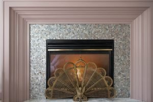
Close-up of the mantel, painted in Sherwin Williams Glamour in a semi-gloss finish, and the mosaic tile surround. The first time I saw a mother-of-pearl mosaic tile, I vowed to my Pisces self I would use it somewhere in my home, and I’m so happy I finally got to use it here. Notice how the shimmery grays, mauves, and pale blues in the penny rounds incorporate all of the soft tones in the Romantic Retreat. I’ve owned the vintage brass peacock fire screen for awhile, and I think it adds the perfect quirky touch to the fireplace vignette
Close-up of the mantel decor and sconces. We’ve owned this art print by Michael Parkes, called “Tuesday’s Child” for many years, and I’m so happy that it works so well in the Romantic Retreat. I’ve always loved the dreamy, whimsical quality of the print, and the colors tie in so well with the mosaic fireplace surround. Although the majority of the fireplace and art are in the softer tones of the space, I did want to bring in a little excitement by adding in pops of the brighter colors. I started with the shades for the sconces (more details on all of the lighting in my Week Six blog post), which are of the same fabric as the Relaxed Roman Shades in the sitting room, and I added a narrower version of the velvet ribbon from the window shades to the tops. The cranberry glass vase is vintage, and the iridescent turquoise vase is from HomeGoods years ago.
Romantic Retreat Product Links
I’ve linked as many items from the Romantic Retreat as I could below, but if you have any questions about a particular piece that I haven’t listed, feel free to reach out to me via this link!
Billie and Me Basking in the Joy of Completing the Romantic Retreat One Room Challenge!
I truly hope you’ve enjoyed following along on this Romantic Retreat One Room Challenge Journey! I’ve loved sharing it with you, and would love to help you create a highly personal,color, pattern, and detail-rich space, that you’ll love and be inspired by for years to come! Click here to inquire about working with me.