


Welcome to the Blue Leopard Interiors Blog, and welcome to Week Three of the Fall 2024 One Room Challenge – I’m so glad you’re here! In case you’re new here, I’m an interior designer based in Great Falls, Virginia, and I specialize in making homes a bold statement of the people who live in them. Restrained neutrals and reserved, “White House Style” decor are not my forté (despite being located in the DC area!), but for clients seeking a home that is anything BUT ordinary, I’m your girl!
This fall, I’m once again participating the One Room Challenge in an effort to make over my own home. The ORC is an eight week online event which happens every spring and fall, where interior decorators and home bloggers, undertake redesigning or designing from scratch a room of their choosing, while sharing the progress along the way. It’s not a competition, as there is no winner, just a supportive group of like-minded design enthusiasts challenging themselves to complete a room in eight weeks. The One Room Challenge tends to be addictive – although it can be stressful making over an entire room in eight weeks-it’s also the best way to stick to a deadline and tackle your biggest home projects! And apparently, I just can’t get enough as it is my FIFTH ORC!, and I’m making over our Primary Bedroom and Sitting Room into a “Romantic Retreat”! If you’re curious to see all of my past ORC projects, you can find the final reveal of the Dining Room & Butler’s Pantry here, my Formal Living Room here, my Kitchen here, and my back Deck and Patio here. And for other commercial and residential client projects, check out my Portfolio here.
I’m so excited to share the progress we’ve made this week – let’s jump right in!
Choosing Paint Colors for the Romantic Retreat
In order to explain how I chose the paint colors for this room, I have to talk about my design process first. Whether I’m designing a room for myself or a client, I always look at which elements in the room are staying, and which will be replaced or added in. Some examples of these elements might be hard finishes, such as flooring, tile, trim, etc., as well as large furniture ,art, and rugs. Choosing to keep certain beloved pieces in a client’s home not only saves money and time, but it’s much better for the environment, and whether they’re sentimental, valuable, or just really unique, give the rooms personality, and can often give us a jumping off point for our design concept. So part of my creative process is to work these “forever” pieces into the design scheme and make other choices that work with them. I typically choose paint colors for a project after we’ve specified all of our large elements in the rooms. There are thousands of paint colors to choose from, so it always makes sense to choose paint last, so that you can choose a color that works with all of the other big design elements in the room such as large furniture (especially upholstered pieces), rugs, wallpaper, etc.
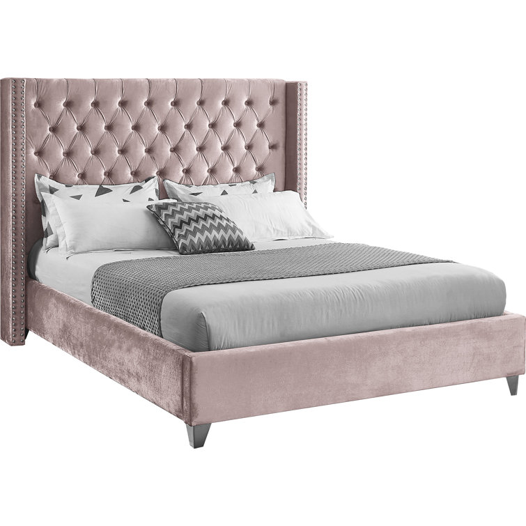
So applying my design process to our Primary Bedroom and Sitting Room, I knew I wanted to keep our bed frame, our rug, a large armoire, and a vintage chair I’ve owned for many years. The bed frame was probably the element that made the most impact on the design decisions – not only financial (since keeping it meant I didn’t have to spend a large portion of my small budget on a new bed) – but also design-wise. The bed is a king size, mauve velvet, tufted wingback style, that I adored when I first purchased it several years ago. I have always loved the color Mauve, and although I had to do a little convincing that my husband WOULD enjoy sleeping in a pinkish, velvet, very “glam” bed, he had to admit it looked great when we installed it. Here’s the bed (as well as some of the other furnishings I plan to keep), in our old bedroom of the house we sold in 2022:

The rug you see above was purchased by my husband on a trip to Turkey, and is really beautiful. It was slightly small for our old bedroom, but it’s going to be the perfect size for our new room. It’s still rolled up from when we moved, but I’m excited to install it because the colors will work even better with the new room.
The arm chair and the little bench (years ago I had them both silver-leafed and reupholstered in a pretty aqua and light grey reptile print chenille fabric), both came from my favorite vintage furniture source in Cape Town, and moved with us to Virginia in 2009. I definitely plan to reuse the chair in the Romantic Retreat, but the bench is slightly small for the end of the bed, so I might find a new spot for it.
Fast forward to now, (or at least last week!), when the dramatic mauve velvet bed looked very awkward in our “beige fantasy” (more like nightmare for me!) of a bedroom in this house:

The color doesn’t even look the same in here, and nothing related to each other any longer – whomp, whomp…
But never fear, Justine the Color Lover is here! Because I know that this bed could look fabulous and intentional with the right paint colors, I knew I could keep it in the new design, and save ourselves beaucoup bucks by not buying a new one. I still love the color (always have, always will), and the style is pretty timeless. Do I wish I could afford a brand-new, slightly more streamlined and modern bed like this?

Yes, of course, but money doesn’t grow on trees and beds aren’t really compostable. Therefore, in interest of my budget, and the planet, the bed stays! And since the king-sized bed is large, it somewhat dictates what the paint color choices will be. And they do still sell it on Wayfair, so I guess the style isn’t too dated!
I had also chosen my wallpaper mural early on in the process, and it pretty much contains all of my favorite colors, so I knew pulling paint colors from it would work well. Here is my gorgeous mural, which I am beyond excited to have installed!

Isn’t she incredible?!?! I am so in love, and next week I’ll talk about my process for choosing her, but let’s get back to choosing paint colors! Obviously, I had a host of glorious colors to pull from this mural, but I wanted the overall vibe of the bedroom to be calming and soft – it is a “Retreat” after all!
So with the bed in mind, I pulled a bunch of mauve tones from my paint deck Hot Tip: if you’re choosing paint colors – never go by the tiny little chip you get on the deck! Use that as an overall guide to find colors that might work, then order the LARGEST samples you can get – order several – and instead of sticking them directly to the wall, stick them onto a piece of white poster board which is larger than the sample, with white all around the color, and THEN hold them up to your wall. It’s super important to look at the color next to all of the large elements in the room that you’re keeping, like large furniture, flooring, etc, and look at it on lots of walls in different light. Color is relative, so the white border around the color sample allows you to see the color for what it is, without your current colors influencing it!
I knew I wanted to find a wall color for the bedroom which is several shades lighter than the bed, and I wanted to use a slightly darker mauve for all of the trim. I looked at lots of pale mauve shades, landed on Sherwin Williams White Truffle for the walls, and then chose another a darker mauve, Sherwin Williams Glamour, for the trim.

I loved the combination, but also wanted to bring in some of the greens of the mural, and by this time, I knew the mural would be used in the sitting room. So keeping with the idea of choosing a light color for the walls, and a darker tone of the same color for the trim, I decided to have my cake and eat it too, and use two totally different colors on the sitting room walls and trim, even though the two rooms are open to each other! This is a fairly “risky” design decision, that in all honesty, I might not suggest for a client, unless they were like me, and really loved and wanted allll the colors! But I knew I would like seeing both wall colors and both trim colors at once, so I went for it, and chose Sherwin Williams Sea Salt for the walls, and Sherwin Williams Silvermist for the trim.

Little did I know that by choosing these wall and trim colors for the bedroom and sitting room, I was leaning into a big “trend” in current paint techniques. I guess when a person spends most (read: ALL) of her free time looking through design books, magazines, and internet articles, it’s likely she will be influenced by trends without even realizing it! The trend I’m talking about is Double Drenching, so let’s see some examples.
What is the Double Drenching Paint Technique?
House Beautiful just published an article on Double Drenching couple of weeks ago (mind you, I chose my paint colors towards the end of August), as have Elle Decor, Real Simple and Remodelista. House Beautiful says the term was coined by British paint company Little Greene, who say: “Double drenching is a powerful painting technique that involves drenching all available surfaces (walls, ceilings, radiators, woodwork) in two or more colours within the same colour palette.” It’s similar to another trend, simply called Color Drenching, which I applied to my Whimsical Parlor One Room Challenge Spring 2023, where one color is used to paint walls, trim, etc in the same color. Little Greene has some great examples of Double Drenching on their website:


How to use Double Drenching in a Room Successfully
As you can see in the examples above, all of these rooms work well because the paint colors have similar undertones, and they are repeated in the other elements in the room. In the living room above, you have three shades of green (I once heard one of my favorite designers, Jonathan Adler, talking about how he will repeat several shades of the same color in a room, and that this can often work better to create a color scheme than trying to match a color exactly, and this statement opened up a whole new way of thinking about color to me), and the bright, olive shade is repeated in the rug. In the kitchen, the table and cabinets are a similar tone to the trim, and in the kid’s room, the blue-striped sheets are similar to the wall color. Also note, that each of these rooms throws in a “pop” of an accent color – the blue of the lamp and chair in the living room, and the reds in both the kitchen and kids room. So Double Drenching doesn’t mean EVERYTHING in the room has to be a shade of your wall, trim, and ceiling colors. That shade should be repeated in the room, but there can also be an accent color, which I might argue “pops” even more with all of the other hues being similar to each other.
As mentioned above, my bedroom is very much open to the sitting room, especially since we removed the dreaded “decorative columns” last week, and both rooms share a ceiling. Using different wall and trim colors in the two rooms was not that difficult, because there was an opening where we could end each color and start the next. But the other than the tray ceiling above the bed, the rest of the ceiling is continuous between both rooms, so it had to be one color. Here’s a photo of the bedroom looking from the bay window towards the sitting room from before we moved in:

Again looking to the wallpaper as my muse, I chose a pale, pastel, greenish-blue called Glimmer by Sherwin Williams to mimic the little peeks of sky at the top of the mural:

I asked my painters to do a sample patch of Glimmer on the ceiling next to the newly painted walls and trim – and I loved it!


Double Drenched Romantic Retreat
I am super happy with how my bedroom and sitting paint turned out! I think the colors are all so lovely and work really well together, and once the wallpaper mural is installed they’ll make even more sense in the rooms. I can’t show you too much of the rooms now without giving away a few other updates that have happened that I’m saving for a later post, but here are a few more photos to give you an idea of how it turned out!


I’m in love with all of the colors in both rooms, but perhaps the biggest impact, was on the fireplace!! Here’s what it looked like before paint:

And here’s a sneak peek of how it looks now!

So that’s it for this week, but hopefully this post was helpful if you’re thinking of trying out the Double Drenching trend!! Make sure to check out all of my fellow participants’ updates here, and make sure to come back next week when the wallpaper mural is installed!!
Cheers,
Justine

Here is my ORC progress
Week 1 || Week 2 || Week 3 || Week 4 || Week 5 || Week 6 || Week 7 || Week 8


